Wednesday, 16 March 2016

F1 2016: Livery Reviews

Now all the teams have officially unveiled their 2016 cars in their race livery, I have written a review of how I feel each car looks and what could be improved on it. The first thing I am going to say is in my opinion, I think this year has been a better year for car liveries than previous years. Its really good to see that some teams have listened to fans complaints about how dull liveries have got these days. Here I've done a team-by-team review of each car.


Mercedes

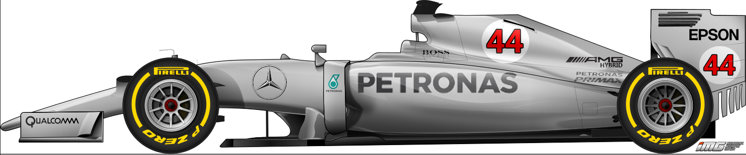
I've said many times that Mercedes should scrap the green and go for a plain silver livery with the numbers in a white circle on the engine cover, harking back to the 1930s, but they clearly haven't done that, in fact they have increased the amount of green on the car, but it is a massive improvement on the last couple of years. The fact they are using the black to separate the green from the silver gives the livery a bit of a Brawn GP feel but with different colours, and the fact the green now separates onto the side of the bulkhead as well makes it more consistent.


Ferrari
Ferrari SF16-H Launch
Finally Ferrari have done something with their typical red! Something I have been waiting for them to do for years, which is bring back the white engine cover from the 1970s! The white engine cover really goes well with the red, as well as the red stripe on the underside, they were clearly trying to replicate their 1970s livery. The only improvement I think they could do to it is replace the black with the Italian flag stripes.


Williams

Not much to say about the Williams, people say more can be made out of the Martini stripe but if more was made out of it, it would look tacky and wouldn't have the historic image this one has. So I'm happy they've stuck with what they had.
Red Bull

At first, when it was unveiled, I thought it was absolutely hideous, especially as in the studio room, the blue looked black. I thought the matte finish really did not work, but after seeing pictures of it on track, it has really grown on me. It may look hideous at night races but it stands out in daytime, even though I still preferred the Infiniti livery.
Force India

I was a little disappointed they had kept the same livery, as I feel that this livery is good and striking but is a livery that only works for one year in my opinion. If they kept the same livery, they should've added a bit more green to it but at least I don't have to get used to seeing my favourite team in a new livery again...
Toro Rosso
I was hoping to see the Toro Rosso return to its old livery from 2006-2008 with the bull filling up the whole side of the car. So on first sight I was disappointed, but with Cepsa gone, that has created more space, and they have made good use of that space by promoting one of Red Bull's brands, it really works.
Renault
This in my opinion is one of the big disappointments of this year. It was a relief to find the livery they unveiled in France was not the race livery. But this livery is better but not by much. Good they have chosen yellow as the base colour, but I am disappointed with the lack of the classic black stripes. It just looks very bare, and a bit too Jordan-esque, which is not what a Renault should look like. Yellow should obviously be the base colour but they need some of the black stripes. Like the Sauber which is the next car to talk about, its two colours with a lot of potential to look good but they haven't made good use of them.
Sauber
Like the Renault, this is one of the big disappointments of last year really, the fact that blue and yellow are two colours that have a lot of potential but the team haven't made good use of them. It was disappointing that they stuck with this livery as it just looks bare.
McLaren
Some people were disappointed that McLaren kept the same livery but I think this is a livery that does work for the team, and if they win races, this could be a livery that people remember, the menacing gun metal colour they have used along with the red McLaren curves really works and makes the team stand out.
Manor
Screen Shot 2016-02-22 at 10.22.52.png
This is one of the most praised liveries on the F1 grid. Manor clearly made an effort with this livery. Firstly good to see that they have kept their fluorescent red, and secondly the addition of the metallic blue really looks nice, especially with the white separating the red from the blue. Its a livery that will really stand out. Good job Manor!
Haas
At first Gene Haas kept saying their car was going to be yellow, they said they wanted to stand out from the rest and at that time when Gene said it, there wasn't much yellow on the grid so that would've, and I think yellow was their original plan. But then Renault joined, and with them likely to go for yellow as their livery, the yellow wouldn't then 'stand out from the rest' as Haas wanted it to. Haas though have picked a good alternative. The silver and the black alone would be an extremely dull livery. But the red really gives the car character and definitely does make it a recognisable livery that stands out from the rest. I wouldn't be surprised if their original plan was this livery but the silver replaced with yellow, I can see how that would've worked, but they have picked a great alternative.


So there we have it, as I said, I think this year has been a better year for car liveries, with more colour on the grid, especially with the addition of the Renault yellow. Each colour that should be on the grid has a reasonable presence, however there are still annoyingly a lot of monochrome cars on the grid...


Tuesday, 16 February 2016

F1 2016 Liveries


Its that time of year where people start making concepts of what they think the F1 cars should look like. And every year, the F1 community comes up with some fantastic designs that work extremely well and would really stand out. And for the past few years, everyone would be disappointed when the actual thing is revealed to be an extremely dull, uninspiring colour scheme. Take the 2015 Sauber C34 for example. Will Buxton (WillTheF1Journo) likened it to a livery designed in Microsoft Paint in 1998. That is an understatement. If someone gave me MS Paint 1998, I could probably design a much better and more inspiring livery quite easily, and so could most other people. In fact, I could probably design a much better livery on paper, like many others can. So what's different about the actual livery designers? Why can't they just get some colouring pencils out and think of good livery ideas that would make them stand out? And if they are struggling for ideas, how about they look at all the concepts that are done of their cars? When I design CRC cars, it takes like 15-20 minutes to come up with a good idea that works as a proper livery, unlike the dull designs F1 teams come up with? It just feels for the past 2 years, teams have just been slapping paint onto their cars in the hope it makes it look good without putting thought into it...


Here's what I, as a graphic design student, feel each team should do, which includes concepts I have done for each teams.


Mercedes

For the last few years, Mercedes have sported a silver livery with green highlights to reflect the Petronas brand. Mercedes changing from silver would be like Ferrari changing from red. Their silver comes from one race in the 1930s where their car was painted in white, but one race, the car is overweight, so they scratched off the white paint to make their car lighter and then raced to victory, They have raced in silver since, so I think they should scrap the green and black highlights and just go for a plain silver design. Like this...
Pre_War_Style_W05_Livery copy
That livery would work very well because its old school and fits in with the Mercedes tradition, and it would be easily recognisable as a Mercedes. Yes Petronas probably pay to have Mercedes paint the green on their car, but they are a rich company, they don't need the money. But to be honest I doubt they are going to go down this route unfortunately, and I think their livery is going to be similar to the 2015 car.


Displaying Mercedes mockuo.png


Here is my concept.
As you can see the base design, I got from the above concept, but I've made it a bit more realistic. I've put the Petronas logo back on the sidepod and moved the number up to the engine cover. This actually has a positive effect as I actually think the number works better on the engine cover than on the sidepod. This means goodbye to the big Mercedes logo on the engine cover but judging by the Mercedes site, it seems BlackBerry have gone as a sponsor, which creates space on the side of the bulkhead, which I think is a perfect position for the Mercedes logo. Something like this would be brilliant for Mercedes' livery, as it is a retro livery brought up to modern standards. Of course the car will probably have a similar livery to last year as I said, but I don't know why, as in my opinion, the Petronas logo stands out better on this design than it does on the green.


Ferrari

With one historic brand I said they should simplify their livery to make more of an impact, with another I think Ferrari should add more to their red livery. Look at their 1976 car...
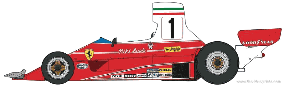
With a bit of modernising and accommodating to the team's current sponsors, this could look fantastic on a modern F1 car and it is a livery that would work. And here is an example...


That is a design that would work extremely well. There are rumours of them going for a red and white livery this year, and I do really hope they go down this route, because its bold, it makes an impact and fits in with Ferrari's traditions...
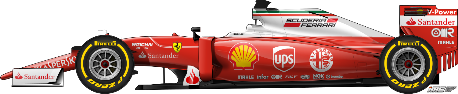


This is my concept. As you can see, I've basically taken the livery from above but modernised it, by adding the current sponsors. This livery works as its old school, its recognisable and it would make Ferrari stand out as a brand. Something else to note, it wouldn't be visible in this shot but why not put the driver names in the retro 'handwritten' font, the way Niki Lauda's name was written on the 1976 Ferrari.


Williams

This car I don't have much to say they should do or criticise about their livery because this is one of the few liveries on the 2015 grid that I think works very well. Since the livery was first used in 2014, people said more could be made out of the Martini stripes, but in my opinion, they've done the best they can out of them. If they made more out of the stripes, it would just look too 'junked up.' I think they should stick with this design for many more years because it works.
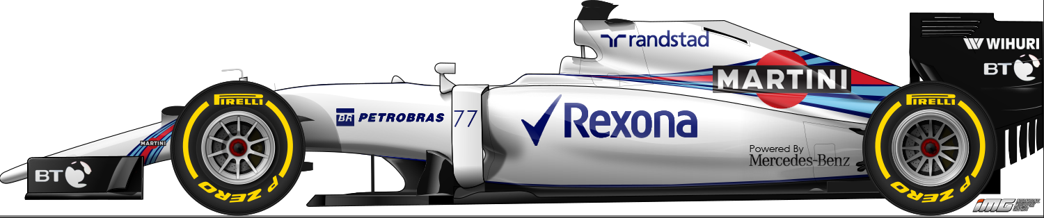


As you can see the concept I've done is the same livery as its predecessor, but I have rearranged a few of the sponsors. I've removed the sponsors that are not on the Williams site, because if their not on the site, then its likely they have parted company with the team. I've given BT a bit more exposure, such a large company needs that exposure.


Red Bull

Red Bull is another one of the liveries on the 2015 grid that worked. It is colourful and really shows off Red Bull as a brand really well. The addition of the purple in 2013, at first I didn't really like it, but it grew on me. Unfortunately, the purple is most likely going to go seen as they have lost the Infiniti sponsorship to Renault. What I think they should do is just have a livery similar to 2012, before the Infiniti sponsorship took over, as that is the livery all their junior drivers carry, so there is no reason why they shouldn't do it, but judging by the fact they are holding a livery launch event tomorrow seemingly with Tag Heuer as a massive part of it does make me think we might see something different to that.
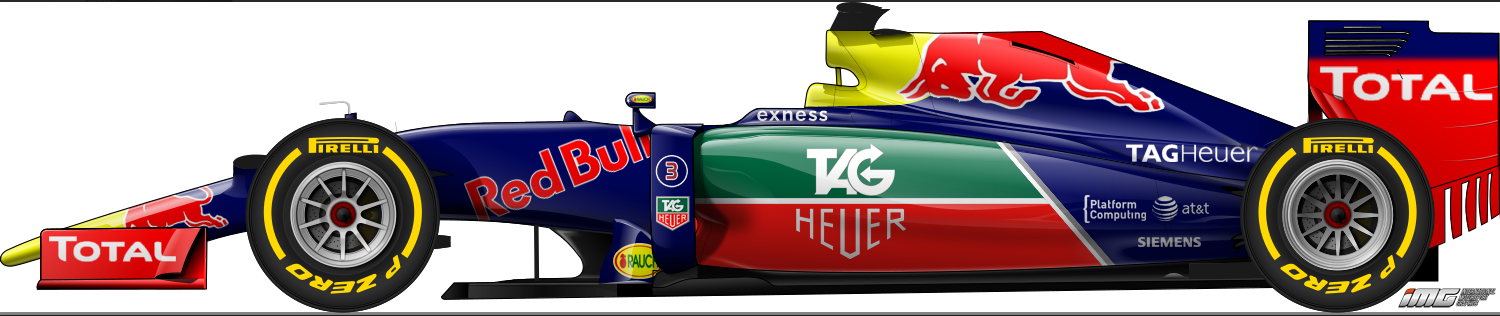


With this concept, I have basically taken the 2015 livery, but replaced the Infiniti branding with Tag Heuer branding. This livery works, especially as after the loss of Caterham, green has become a sparse colour to the F1 grid.


Force India
Force India is another team that I thought had a striking design in 2015. The black and the silver alone would've been an extremely dull livery, but the orange lines separating the silver and the black turn it into a striking and stunning design, but I feel this is a design that only works for one year. 


Recently, Jehan Daruvala in the Toyota challenge series used this livery on his car, which implies we might expect to see something different this year. Especially as only twice have Force India stuck with the same livery as before.
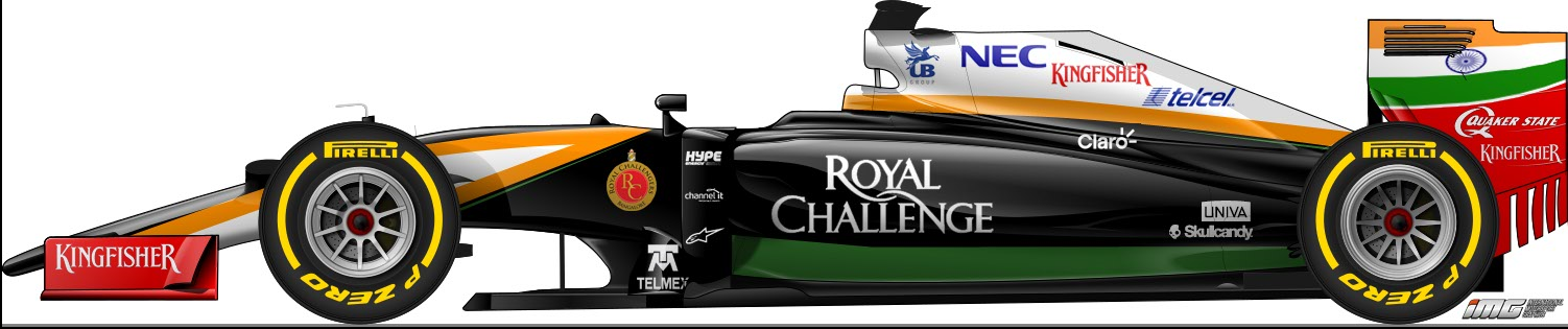


This is the concept I produced. One notable absence is the Sahara logos, but it does seem that Sahara want to sell their stake in the team, so that logo may be absent from the car this year. Also gone is the silver on this concept. Now the white parts I did try in silver but it did not really work as well as they do when white. I've also added Kingfisher red back to the car, which with Sahara gone, they might return to being their title sponsor, the red really works with the rest of the car.

Toro Rosso
Alone, as a design, the Toro Rosso is a very nice livery, but the fact it's too similar to the Red Bull is the thing that bugs me about this livery, especially with Red Bull losing the Infiniti sponsorship, I feel they need to do something different this year. I think they should go back in time and recreate their 2006-2008 livery on their 2016 car, especially as Cepsa are gone which gives them more freedom.

The bull on the side is very distinctive, its colourful and it really works well as a livery for a Red Bull junior team. Its a mega design that should be carried out on their 2016 car.
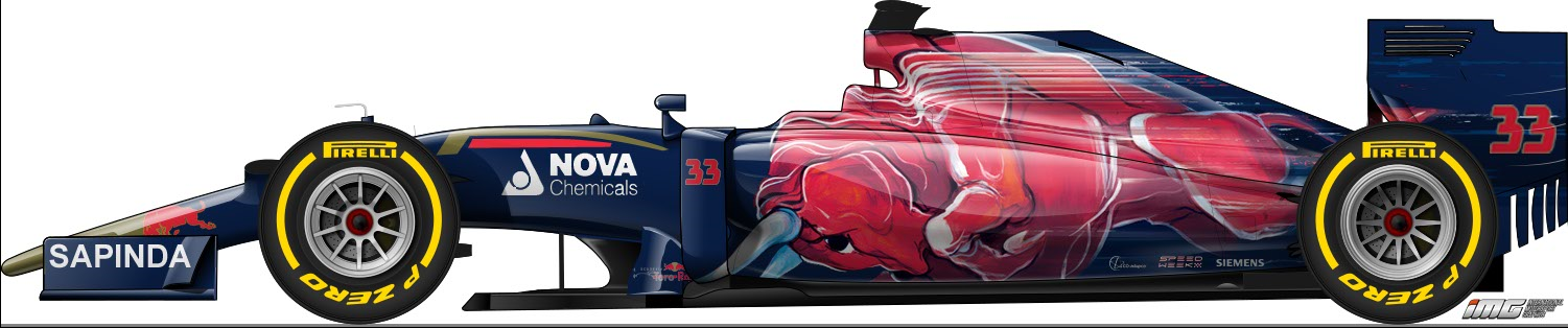


This is the concept I have done. As you can see, I have basically taken their 2006-2008 livery but also added the modern attributes seen on a Toro Rosso these days. One notable thing I have also done is added the number to the endplate, which really fits in well with the bull. I honestly have no idea why they even ditched this livery in 2009 in the first place.

Renault

When Renault returned to F1, the big talking point was what livery they were going to use, as a constructor they were known for having striking liveries.


The 2010 Renault R30 was probably my favourite livery ever to be on the F1 grid. It was bold, it was striking, and easily recognisable as a Renault. It wasn't too simple, but also wasn't too packed. It was mega.

When Renault unveiled their '2016 testcar' at the launch, we all grimaced when the sheets were taken off. Renault had been on twitter asking people to send them their concepts, and what was unveiled was a plain black car with touches of yellow. (the car seen above the R30 in this post) We all couldn't believe after all the concepts sent to them and all the competitions they ran regarding liveries, they came up with that. We all breathed a sigh of relief when it was revealed just to be a testing livery and a new livery will be unveiled before Melbourne.
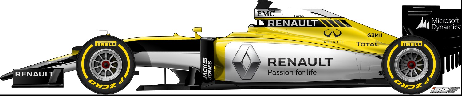

This is the concept I have done. I have gone for an 80s style livery. It took a bit of experimenting before I painted a design that I was happy with. The yellow, black and white, really gives off an old school feel. Another retro touch I've added as well, is I've put a 'Turbo' sign with black lines beside it on the engine cover, as seen on the Renaults of the 1980s, which adds a bit more to the livery and also makes sense seen as they invented the turbo in F1.

Sauber

As I mentioned earlier, the Sauber C34 was one of the major livery letdowns of the 2015 season. I spoke a lot about this livery at the start of the post. When the rumours came around that they'd incorporate a blue and yellow livery, everyone was excited, but then they obviously unveiled that.
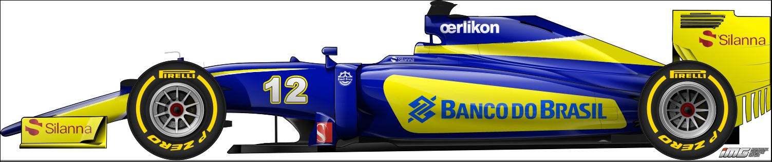
This is the concept I did for the 2016 Sauber. I've included a bit of Nasr's GP2 car from 2014 into it, as well as getting inspiration from the Saubers of the early-mid 2000s. I've also changed the shade of blue from that dull plastic blue seen on the 2015 car to a metallic blue. This livery I feel works as it isn't too simple but not too packed. It gives a Renault e.dams Formula E feel.

McLaren

When the McLaren MP4-30 was launched, everyone was dissastified with it. I personally had no problem with it, but a lot of people disliked it so they changed the livery to this...

This was an OK looking car, but not the red and white many fans were hoping for. Many concepts had come up of a packed white, red and black livery for the McLaren Honda, but I think they should go for a reasonably simple approach.
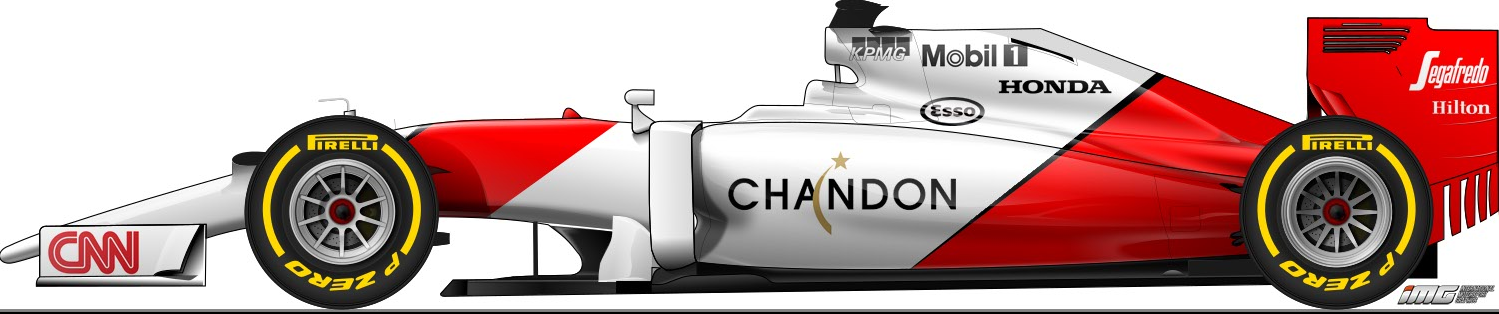
Here for the concept, I've painted McLaren's Marlboro livery onto the car but gone for a modern approach, by adding the black accents to separate the red and the white, which really modernises it. Its a livery that works.

Manor

Manor have always produced an extremely nice livery from the start of their days in F1. In so little time before they made the grid, they incorporated a really nice, striking livery, with red and white. Blue was added to the colour scheme at Silverstone courtesy of Flex-Box, which at first I didn't think went with the car but it grew on me.
Manor F1
Since then Manor unveiled this new logo, which does imply we might expect to see something different this year, but I think the red will remain, but more black will be seen on the car.
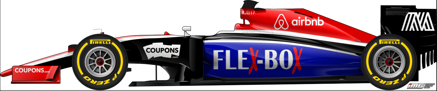
This is the mockup I've done on the Manor. As you can see, I've incorporated a red, black, white and FlexBox blue colour scheme. This really is a unique stand-out livery, which has shades of their 2014 car which in my opinion they should bring back as well as their sponsors.

Haas
There has been plenty of speculation about what Haas F1's first ever livery is going to be. Gene Haas said he likes yellow, which implies we are going to see a yellow car on the grid. But their garages, trucks and pit equipment are white, black and red...
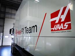
Image result for haas f1
However I don't think this means we are not going to see Haas paint their first car yellow. In fact yellow might work quite well with that.
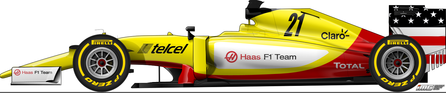
This concept I've done uses yellow as the base colour, but with some white, black and red from the teams' equipment incorporated. Other notable things I have included on the livery are a rendition of the stars and stripes on the rear wing endplate, inspired by what Manor ran at the US GP last year (with the blue painted in black instead to fit in with the team's colours. I also put the number on the engine cover. All American motorsport teams make their numbers clearly visible, so I felt that was something that must be included.


So there we have it, what I feel each team should do with their liveries this year. Lets hope that when the real things come out, starting with the Red Bull livery tomorrow, we are not disappointed.

Wednesday, 3 February 2016

Renault RS16 Launch

Renault RS16 livery launch


Introduction
Less than an hour before I wrote this, Renault took the covers off their 2016 challenger, and the first car of their return to F1, the RS16. Today was clearly a special day for them as they not only revealed their car but also announced their driver line-up as well.


Magnussen's signing
Kevin Magnussen 2012-2.JPG
It was known before that Renault were going to give the seat vacated by Maldonado to Magnussen but it wasn't officially announced till the launch. I am personally delighted he is getting a second chance, because in my opinion I think it should've been Jenson Button dropped at the end of 2014 because, yes he is experienced and is a very professional driver, I personally think he has passed his best now. And it really did look like Magnussen's career was all but over, which would've been such a shame as 1 year is an all too short career for such a talented driver. And the fact he is driving alongside Jolyon Palmer, I think that is a very strong line-up.


Ocon's signing as reserve

What will be considered less significant out of the announcements at the launch is the signing of 2015 GP3 champion as reserve driver, Esteban Ocon. This is massive for him in my opinion. He does know the Enstone team very well firstly, as he competed in a few test and practice sessions with them. It did look for a while like he was going to go to DTM, but this reserve role, as well as the fact Renault aren't in DTM, seems to point out he is going to do something else. I do believe he will race this year as well, so I can see him going to GP2. As that's where most GP3 champions have landed in the past in the next year.


The car

Looking at the car, there are a few interesting things to point out. Some things have clearly been carried over from the Enstone squad's 2015 car. The nose, engine cover and the rear wing have been carried over from the E23. The fact the engine cover carries over does surprise me because some of the car would've had to be modified to accommodate the Renault engine. The sidepods I can notice a difference in however, the sidepods seem to be a similar design to that of the Williams FW37. The front wing I also notice has a bit more to it than the predecessor as well. I was expecting to see more yellow on the livery, I am going to talk more about that in my next blog post.

Sunday, 5 April 2015

Jules Bianchi: 6 months on

Six months have passed since arguably the saddest day in F1 since I started following the sport almost 10 years ago.

I still remember everything about that morning, getting up excited about the prospect of a Grand Prix but just a couple of hours later shaking with fear on the verge of tears. I still remember how scary the situation was, how no one, not even Sky F1 knew who and what the stretcher and the ambulance were there for until the bright red and black rear wing endplate being picked up came into shot, and I remember the moment David Croft announced that Jules Bianchi was there, my heart just sunk (as I'm sure was the case with everyone else who watched the race) as judging by the wherabouts of his car, it was really obvious to all what had happened, and it was really obvious to all that it was gravely serious.

6 months later and there has not been a day where I haven't thought about him, and I honestly can't believe that he has spent half a year in a coma without even any signs of awakening as far as we know.

All the whole world of F1 is hoping now is that a miracle occurs and Jules is able to make a recovery.

#ForzaJules

Friday, 6 February 2015

Manor F1 Team - Is it all over?

Yesterday, we received news that Marussia, now called Manor have not received a dispensation to use their 2014 car, which is a huge blow to their hopes of participating in the 2015 season.


However they haven't confirmed they won't be in Australia yet, and I can see why. BBC says that the changes to the 2015 regulations make it "close to impossible" to modify the 2014 MR01 to accommodate the 2015 regulations. However is that really true?


All that has changed in the regulations is the front bulkhead has to be lower and the nosecone must change. However going by the past, we know that is possible, Brawn GP in 2009 had to change the back of the chassis completely in mere hours to accommodate the Mercedes engine, and tested the car that same day. Manor have over a month to do so, and that should be enough to modify, develop and test the updated MR01 so it can accommodate the regulations.


However I don't think they should do that. In my opinion, whatever they do, they should put their return on hold till 2016, because there is no point racing this year as they will just be backmarkers like they were. However if they delay their return till 2016, they will have a whole year to sort themselves out with the new investor and develop a 2016 car, and then 2016 could easily be their best season, as they will have had longer than they have ever had before to develop a race car.

Monday, 22 December 2014

Bianchi crash findings - My opinions

This has been a subject for debate over the past couple of months, because it's clear that if the FIA take the correct action, they can prevent this sort of accident from ever happening again. Here is my opinion on some of the FIA's findings regarding the crash.

"Bianchi did not slow sufficiently to avoid losing control at the same point on the track as Sutil."

What's obvious from the first findings is that double yellow flag rules are not enough to prevent accidents like this. The rules stated you had to prove you have lifted, but as mentioned in that previous quote, all a driver has to do is prove they've lifted off to avoid a penalty, no matter how small the lift is. And as a racing driver, they want to lose as little time as possible in this process, so the drivers can just take their foot off the throttle for a millisecond, and satisfy the rules. That's wrong, and dangerous, in my opinion. That's why I think Jules Bianchi isn't to blame for the incident. I'm pretty sure he would've lifted slightly (obviously this lift would've been small), cos otherwise he would've got a penalty from the stewards, and yes, he did "over-controlled the oversteering car," but he wouldn't have if the rules had been more strict on this matter. So this part of the incident in my opinion, wasn't Jules' fault. In my opinion it was the fact that the rules were too lenient, that drivers get away with even small lifts under double yellow flags without getting a 5 second stop and go penalty or worse, when if the rules were stricter, Jules would've slowed sufficiently enough to avoid spinning off and hitting the crane and the accident would've been prevented.

"The actions taken following Sutil’s accident were consistent with the regulations, and their interpretation following 384 incidents in the preceding eight years. Without the benefit of hindsight, there is no apparent reason why the Safety Car should have been deployed either before or after Sutil’s accident."

Ermm, FIA? I've been watching F1 for 10 years now and I can't remember any incident where they've had to bring a JCB out, where it was on a wet track that was getting wetter, at a fast corner such as Dunlop where another driver could easily lose control at the same point. They should've thought back to Japan 1994, where at the same corner Martin Brundle almost had a similar accident. As I said on twitter immediately after the incident, it should've been instant safety car, and they should've waited till the safety car had picked up the field before deploying the JCB, then no serious incident.

"During the two seconds Bianchi’s car was leaving the track and traversing the run-off area, he applied both throttle and brake together, using both feet. The FailSafe algorithm is designed to over-ride the throttle and cut the engine, but was inhibited by the Torque Coordinator, which controls the rear Brake-by-Wire system. Bianchi’s Marussia has a unique design of BBW, which proved to be incompatible with the FailSafe settings."

To be honest I don't think this made a difference really. If the engine had cut, it would've only scrubbed a few mph off, which probably wouldn't have made a difference to the outcome. 

"The fact that the FailSafe did not disqualify the engine torque requested by the driver may have affected the impact velocity; it has not been possible to reliably quantify this. However, it may be that Bianchi was distracted by what was happening and the fact that his front wheels had locked, and been unable to steer the car such that it missed the crane."

He had already lost control at this point so doubt that even if he had steered to the right, he would've avoided the crane.

"It is not feasible to mitigate the injuries Bianchi suffered by either enclosing the driver’s cockpit, or fitting skirts to the crane. Neither approach is practical due to the very large forces involved in the accident between a 700kg car striking a 6500kg crane at a speed of 126kph. There is simply insufficient impact structure on a F1 car to absorb the energy of such an impact without either destroying the driver’s survival cell, or generating non-survivable decelerations."

If they'd put skirts on the side of the crane in the same manner as a tyre wall, then they could absorb the impact without damaging the crane and the Bianchi would've walked away. Closed cockpits would probably have made the incident worse to be honest, if there had been a closed cockpit, then it would've probably collapsed on top of him.

So my opinions are that this incident could've been avoided. As soon as the accident happened, Race Control should've thought back to Japan '94. The thing I find wrong is in 1994, Martin Brundle almost hit a recovery vehicle at the same corner in similar conditions with double, and even hit a marshal, causing serious injury. Surely that would've made the FIA think 'We need to do something, if a driver hits a recovery vehicle or spins off in a double yellow zone, that could cause serious injury or worse to a driver or a marshal.' But the fact they did nothing then, and despite close calls in between now and then, they wait 20 years where a driver gets seriously hurt before something is done, in my opinion is wrong. 

Obviously no one can do anything about what's happened now. All everyone can do is just hope and pray that Jules Bianchi will come out of this. What the FIA can also do is learn from it to avoid it happening in the future. Which they have done by introducing a Virtual Safety Car, which hopefully will prevent this sort of incident happening ever again.

#ForzaJules

Sunday, 5 October 2014

Jules Bianchi

Every race, I always look forward to, especially considering the standards of this year's racing. However despite that, I and all motor racing fans have to accept that, even though the risk is not as large as it used to be, one of these drivers, any one of them, could be taken from us.

Today's Japanese GP saw an exciting race, what more could I want, Hamilton won and extended his lead, Force India stay ahead of McLaren, but I wasn't celebrating after today's race. Because of an incident involving Jules Bianchi, where he hit a crane trying to clear away Adrian Sutil's car. All the signs, the marshals around and the fact there was no champagne sprayed on the podium, is not a good sign. We are just patiently waiting for news on Jules, praying that he's going to be OK.

My point is can the FIA learn any lessons from this? In my opinion they can. Not on the safety of the cars. On a totally different subject. This year, the FIA has been very lenient on when to bring the safety car out. In Germany, Adrian Sutil spun at the last corner, and marshals had to run across the racing line, it was just dangerous. Today, when Sutil crashed at Dunlop Corner, they brought the crane out before the safety car, and in my opinion, if they hadn't done that, the incident wouldn't have been as serious. Bianchi would've gone into the tyre wall, and been OK, like Sutil. So why couldn't the FIA have done that?

All I'm hoping now is that Jules Bianchi is going to be OK. I was shaking with fear when I heard what had happened, and I'm hoping and praying he is not seriously injured.

Stay with us Jules.